Mainstream newsrooms love a good colored dot. Whenever a major seismic event breaks, the graphics departments immediately whip up a static map plastered with concentric rings, glowing red epicenters, and clean lines tracing tectonic boundaries. We saw it happen instantly when the devastating doublet earthquakes—a magnitude 7.2 followed a mere 39 seconds later by a massive 7.5 shock—battered northern Venezuela near San Felipe and Yumare.
The media rushed out their standard visual narrative: "Venezuela earthquakes mapped: Where the deadly quakes struck." They pointed to the dots, drew a neat line along the Caribbean-South American plate boundary, and treated the disaster like an isolated, localized lightning strike.
It is lazy journalism, and it fundamentally misdirects public understanding of seismic hazard.
I have spent years analyzing how public data interfaces fail during structural crises, and this specific map obsession misses the entire point. Plotting a couple of latitude and longitude coordinates on a flat screen gives a false sense of containment. It tricks the public, and more importantly, municipal planners, into believing that the danger lives strictly inside those tiny red circles.
The real story of the Venezuelan disaster is not where the quakes started. It is how a highly fractured, invisible web of faults interacted in ways our current safety models completely ignore.
The Myth of the Single Fault
For decades, the standard approach to seismic tracking has relied on a reductionist principle: one fault system equals one rupture threat. When the Boconó fault system or the San Sebastián fault gets mentioned, the public envisions long, neat subterranean highways that slip independently.
The 2026 Venezuela doublet just completely shattered that premise.
According to early data from the U.S. Geological Survey (USGS), we did not witness a single line snapping. We witnessed a domino effect. The initial 7.2 shock near San Felipe didn’t relieve stress; it aggressively loaded stress onto a completely separate intersecting fault, triggering the 7.5 rupture near Yumare less than a minute later.
This is what paleoseismologists call a multi-fault rupture scenario. If this sounds familiar, it is because a similar structural surprise caught the scientific world off guard during the 2016 Kaikōura earthquake in New Zealand. Yet, ten years after Kaikōura, standard risk maps still treat fault lines as isolated silos.
When you look at a traditional news map showing two separate dots, you are looking at an incomplete post-mortem. You are missing the subterranean bridge that connected them. The danger is not the epicenter; it is the structural network.
Ground Motion Amplification Is the Real Killer
Let us look at another massive blind spot in popular earthquake mapping: the obsession with magnitude and proximity. The media repeatedly tells you that the closer you are to the red dot, the worse your fate.
That is flat-out wrong.
During the infamous 1967 Caracas earthquake, a moderate 6.3 magnitude shock struck off the northern coast. By standard mapping logic, the coastal towns should have borne the brunt of the violence, while the capital city of Caracas, nestled safely inside a mountain valley, should have experienced mild shaking. Instead, high-rise buildings in the Caracas Valley collapsed like sandcastles, claiming hundreds of lives.
Why? Because of a mechanics principle known as basin amplification or ground motion amplification.
Caracas sits on top of a deep alluvial basin—essentially a massive bowl of soft, unconsolidated sediment trapped by solid rock. When seismic waves travel through hard bedrock and hit a soft sediment basin, two things happen:
- Velocity drops, forcing the amplitude of the waves to spike dramatically. The shaking gets violently amplified.
- Waves trap themselves within the basin boundaries, bouncing back and forth like water sloshing violently in a bathtub, prolonging the duration of the shaking.
A map that only shows epicenters entirely hides this geological amplification. A neighborhood 40 miles away from the fault line built on soft sediment can easily experience double the peak ground acceleration (PGA) of a neighborhood sitting right next to the epicenter on solid granite. By teaching people to look at dots on a map rather than the soil beneath their boots, we keep them blind to their actual vulnerability.
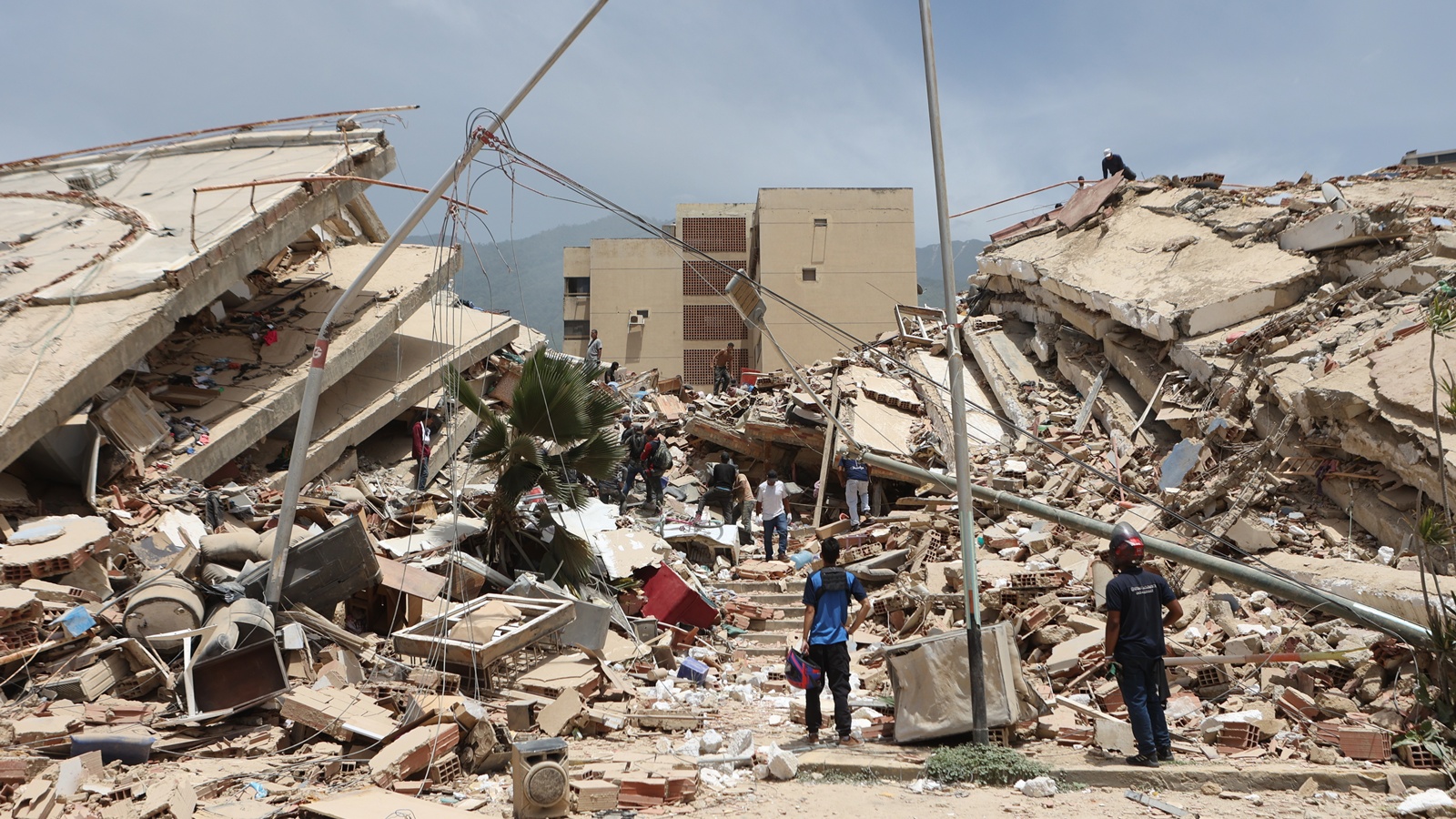
The Fragility of the Built Environment
We must address the elephant in the room that every standard news agency glosses over to avoid political fallout. Earthquakes do not kill people; bad engineering does.
The true metric of a disaster is the structural vulnerability of the local building stock. In northern Venezuela, the intersection of economic stagnation and lack of strict building code enforcement created a catastrophic baseline.
[ Bedrock Seismic Waves ] ---> [ Soft Basin Sediment ] ---> [ Unreinforced Masonry ]
     (Fast, Low Amplitude)          (Slow, High Amplitude)         (Brittle Structural Failure)
In seismic engineering, we look at structural resonance. Every building has a natural frequency at which it vibrates. When soft soil amplifies low-frequency seismic waves, and those waves match the natural frequency of a mid-to-high-rise concrete structure lacking proper ductile detailing, the building enters resonance. The swaying compounds until the columns shear.
Look closely at the structures that failed during this recent doublet. They are overwhelmingly unreinforced masonry and non-ductile concrete frames. These structures have zero capacity to deform under lateral loads. They fail completely and instantly.
The hazard maps published by major institutions show beautiful gradients of peak ground acceleration based on historical models. What they never overlay is the real-time degradation of municipal infrastructure. A 10% probability of exceedance in 50 years means absolutely nothing when the five-story concrete apartment building you live in has suffered from decades of zero maintenance, compromised materials, and unapproved vertical expansions.
Dismantling the Premier Questions
Let us systematically break down the flawed premises filling the internet right now.
Flawed Premise: Can scientists use these maps to predict where the next Venezuelan earthquake will hit?
Absolutely not. Stop asking for predictions. Seismology cannot predict the day, week, or month of an event, and formatting maps with bright red hazard zones gives a false impression of predictive capability. What these maps actually show is historical probability based on fragmented data. When a multi-fault doublet occurs, it proves our current predictive probabilistic models are lagging behind reality.
Flawed Premise: If my city is outside the historical red zones on the map, am I safe?
No. The historical record of seismology is incredibly short compared to geological time. Venezuela has recorded destructive earthquakes for roughly four centuries—a blink of an eye to a tectonic plate. Relying purely on a map of past epicenters assumes that nature has already shown its entire hand. It hasn't.
The Cost of the Counter-Intuitive Approach
If we want to fix how we prepare for tectonic crises, we have to throw away the current mapping aesthetic. We must transition to dynamic, three-dimensional geological models that integrate soil physics, basin geometry, and structural telemetry of individual buildings.
But there is a major downside to this contrarian approach: it is incredibly expensive, computationally heavy, and politically toxic.
Telling a population that their entire valley behaves like an earthquake amplifier lowers property values overnight. It demands billions of dollars in structural retrofitting that developing economies simply do not have. It is far easier for governments and media conglomerates to print a flat map with a couple of red dots, call it a freak act of nature, and hand out emergency supplies after the walls come tumbling down.
Until we stop staring at where the quakes struck and start demanding transparency about why our infrastructure cannot handle multi-fault ruptures, we are just waiting for the next dot to be drawn.